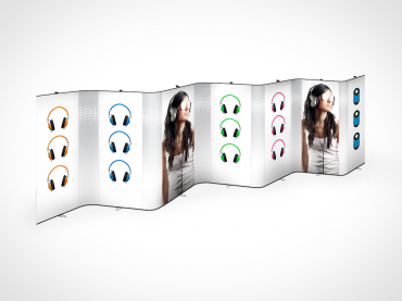
- 5 design tips to stand out at an exhibition
5 design tips to stand out at an exhibition
To keep your message simple on a backwall, retractable display or stand, while making an impact at an exhibition can be quite challenging. It actually does not have to be that difficult. Below we share our best design tips to help you stand out among thousands of visitors – using a clean and clear communication manner.
1. Placement of your logo
At an exhibition or an event, you welcome visitors in front of your backwall, often with a counter or other accessories covering parts of the wall, which means that you need to place your logo on the upper part of your backwall to make it visible to everyone.
2. How do you want to be perceived?
The most important thing to consider when creating a high-resolution artwork is to keep it simple! Do not try to explain your entire business or product function on the backwall – just show your logo and a payoff. Explaining the benefits of your business, products or service is actually your job.
When choosing images or a background colour, use the company's visual identity or graphic profile to create the asociations you would like the visitors to have when thinking about your brand.
3. Keep it simple
Dare to use empty space! The entire backwall does not have to be filled with messages, images or text. Instead, let the blank surface act as a tool to attract the visitor’s eyes on what you want them to see. It makes for a stronger impact and the visitors will remember who you are and what you do, even after the exhibition.
4. Keep it clear, clean and neat
Choose a font that is easy to read and that works in a larger format. When you choose font colour, keep in mind that contrasts are exciting and make your message stand out, which makes it easier to read.
5. Select size and position of your logo according to the size of your display product
For many people, using large formats is a way to be seen, but when it comes to your logo, think proportionally. Start out from the size of your backwall, stand or retractable display and make the size of your logo proportional. Don't make it too large (it will be seen anyway) and always keep blank space around the entire logo. As mentioned above - empty spaces draws the visitors attention to your logo or message.

Need help or want a quote?
Our experienced team is happy to assist you.
We will get back to you quickly.

Need help or want a quote?
Our experienced team is happy to assist you.
We will get back to you quickly.
Contact us
Contact us

Need help or want a quote?
Our experienced team is happy to assist you.
We will get back to you quickly.

Need help or want a quote?
Our experienced team is happy to assist you.
We will get back to you quickly.


